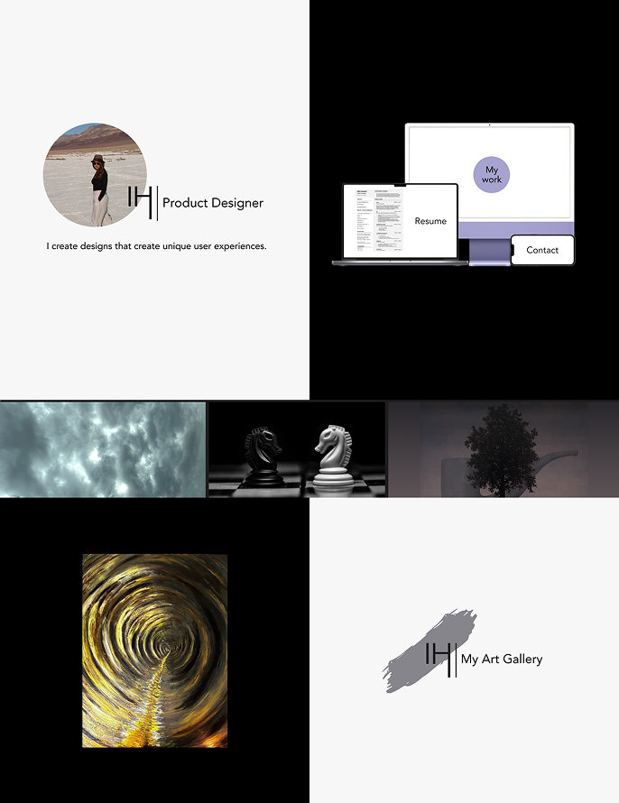
I view design as an application of the scientific method. It requires observation and research, testing and creativity. It enables us to build tools and products that benefit the world.
I bring a background in business and graphic communication. I focus on turning research into clear, useful product experiences while aligning user needs with business goals.
I’ve led projects from research and UX strategy through branding and implementation, working closely with developers and stakeholders to bring ideas to life.

BS Business Administration | Industrial Technology and Packaging Concentration | Graphic Communication Minor
- California Polytechnic State University San Luis Obispo

UX/UI Bootcamp Certificate of Completion
- UC Berkeley Extension


/(10) EditedTeapot Set (1).png)
 Edited Bowls (1).png)
/(1) Edited Handbuilt Set (4).png)

Given 3 weeks with a team of 5 designers, we evaluated and made improvements to the Tahoe Blue Surf website. This project required advanced understanding of the users and the business.
85% of charter bookings for Tahoe Blue Surf are currently done over the phone or in person, wasting the company’s time and resources
I mainly focused on the information architecture with the card sort and site map as well as designing the low/high fidelity.
“Our goal is to increase our bookings by at least 15%. (by the end of the season)”
By updating the UX of the booking process and redesigning the information architecture of the website, users will have a better understanding of the charter process leading to an increase in bookings
To test our Hypothesis statement we conducted cognitive walkthroughs and user interviews. Ultimately the one page layout of the site made it hard for users to find valuable information leading to frustration. Below are some key points from the users.
Users enjoyed the aesthetic of the website, claiming it made the site more “trustworthy” and “professional”
Upon opening site, users did not know what action to take first. Many did not even realize the site was scrollable
Users found the one page format tedious and belaboring due to the amount of information needed to remember
Important information regarding the charters were difficult to find, resulting in an increase in time taken to book
We analyzed the current website to find specific usability issues. Below are 4 of the most impactful issues that we aimed to solve with our redesign.

The video auto playing in the background along with constant animation effects causes confusion for the user. These effects also make the website extremely slow and unresponsive.
On desktop, the primary navigation is practically hidden, being just several vertical dots on the right side of the screen. Users must hover over each dot to read what they are, forcing users to reread their options

Currently, crucial information users must know before booking is practically hidden. In this example the frequently asked questions (FAQ’s) have important information, but can only be found after scrolling through the entire site.

The booking form consists solely of text boxes. However, users expect to only type when completely necessary. In addition the formatting of the contact information on mobile runs off the page and is unable to be read.


The dark theme was chosen to match the style of the original website, however the color is a dark gray rather than black to avoid over contrast. The blue color palette is much softer than the original to convey that the company is personal and friendly.
Source Sans Pro was chosen for the websites fonts because it was bold and easy to read. It also has a variety of alternate styles that enabled for good variation throughout the site.
When the default state is active the button appears very simple and matches the sites sleek design. When the hover state is active the button has a pop of color and depth. This makes the buttons feel very interactive and clickable.
The icons have a unique design with a bold outline that gives the site another pop of color against the dark background.
Conduct further usability testing
Hand off to developer
Evaluate KPI’s to evaluate the usability changes
We hope to remain in contact with the stakeholders and get this project handed off to a developer. Once the site goes live we will evaluate if the new design helped the company reach its goals by analyzing and evaluating various KPI’s.

The task was to make research driven decisions to improve a nonprofit organization website. The project was completed in 3 weeks with a team of 5 designers.
The Pet Network Human Society is a small animal shelter located in the North Tahoe area. They sometimes struggle with staffing and public awareness of their services.
My responsibility was primarily to work on the wireframes and prototyping. I also participated in the user research process with interviews and analysis.
Stakeholder Interview
“If we could get 1-2 volunteers a day that would be life changing”
-Sarah, staff member


We felt there may be a better way for users to select their availability so we deiced to conduct an AB test. Although the results were not decisive we proceeded with variant #2 because it enabled users to be more specific.
User Scenario:
You are applying to volunteer at a pet shelter. You are only available M-F from 7AM-11AM and weekends from 2PM-6PM. Which of the following forms do you prefer?
Results (31 Participants):
54% of testers preferred the variant #2 format because it allowed them to be more specific about their availability


By simplifying the application process, more people will complete this initial step, thus resulting in more volunteers who can help at various times of the week.

Given 3 weeks with a team of 3 designers, we chose a complex problem and created an original solution in the form of a mobile application.
The disconnect between users results in normalization of toxic behavior in online gaming environments.
My responsibility was to participate in the user research/analysis, design the user flow, and the high fidelity mock ups.
Any and all negative action(s) that cause mental distress when gaming
These include but are not limited to:
throwing the game for any reason
verbal/written insults and slurs
continued harassment outside of the game

Headspace is a subscription-based meditation and mindfulness app that includes articles on the science of meditation, podcasts to help the user meditate, and articles on best practices to manage stress.

Strengths:
It is a practical approach to mindfulness that is scientifically supported. It has a user friendly design with interesting animations.
Weaknesses:
The app uses a paid subscription system. It requires commitment and regular use to get results.
Opportunities:
There is a desire for structured programs that prompt users to think differently.
Threats:
This app doesn't have a specific target audience and therefore is not the ideal solution for gaming community.
Discord is a community application that allows users to create communities, known as servers, based on shared interests that can be made either public or private. The service allows for messaging, voice calling, video calling, and screen-sharing.

Strengths:
It is free to use and enables strong community building and interaction between people with similar interests.
Weaknesses:
It is difficult to manage activity in larger servers.
Opportunities:
There is a potential market for users that want an experience that promotes growth and learning as well as connecting with other users.
Threats:
There is very little barrier to toxic behavior and it does not integrate with other platforms
(The Casual Gamer)

In this scenario Jackson is becoming concerned that his current gaming group’s toxic behavior is rubbing off on him. He finds himself being toxic to others as a result of the normalization in his group.
He wants to learn how to deal with toxicity and manage its effect on himself. He also would like to find a new, more positive group to join.


Someone recommends our app and Jackson is able to find a positive community with whom he can play games. He has also learned the best ways to respond to toxicity and how to help others targeted by it.
He, in turn, recommends Antidote to other gamers that were just like him in hopes of building a more positive gaming community overall.
This particular user flow was chosen because it highlights the main focus of the app. Educating the user on how to deal with toxic behaviors.


We have concluded that it is important to try to solve this widespread problem. However, through our testing we learned that an incentive or deeper game integration is necessary for the implementation of our concept.
Develop a battle pass like reward system to incentivize users to use the app. Ex: in game cosmetics, items, emotes
UI elements that help distinguish the app for gamers
Crowley Case Group
To showcase my design abilities in a clear and accessible format, I created a highlight real featuring components of several projects. Below are three project examples with brief descriptions and my design contributions, followed by two full case studies that provide deeper insight into my research, design process, and outcomes. Following those examples are 2 full case studies where you can get an in depth view of my process and capability. These go in depth on research process, design and outcomes.
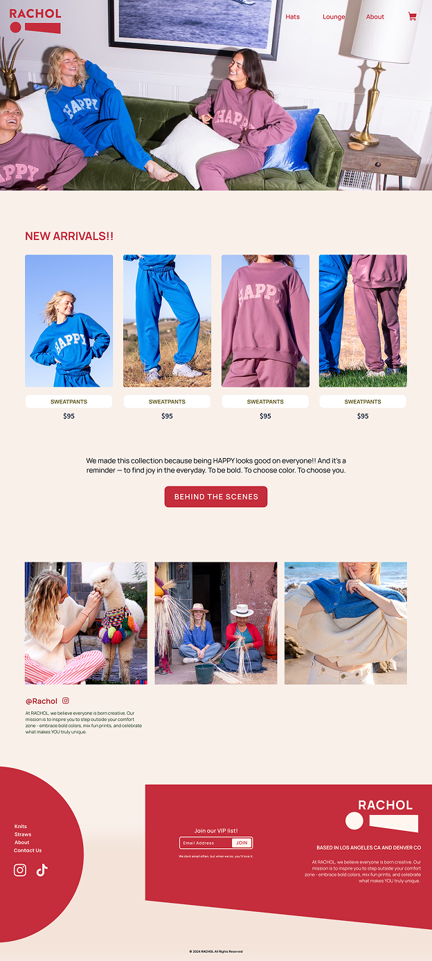
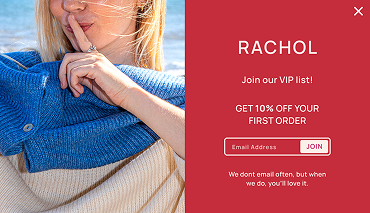
I collaborated closely with the founder to design and launch a responsive website for both web and mobile. My work included organizing the content structure, creating the layout, and contributing to the visual design. Research showed that nearly 80% of potential customers were expected to access the site on mobile devices, so I prioritized mobile accessibility through improved color contrast and tailored UI elements.
The design emphasized brand distinctiveness, ensuring the website felt as unique and purposeful as the clothing. The final version is clean, easy to navigate and focused on guiding potential customers to learn about the brand and explore the products.

Crowley Case Group helps clients navigate the complexity of Yardi property management software. They offer advanced training and consulting to meet their client’s needs.
My goal was to transform their brand and website into something that clearly reflected their expertise while remaining approachable. To achieve this, I redesigned the logo, developed new brand guidelines, and partnered with a developer to implement a full website redesign.
The redesign introduced a modern brand style, streamlined navigation, and clarified content, making services easier to understand and strengthening client trust.
Early feedback from users noted that the new site was “much easier to follow,” and positioned the company as more professional and credible in a competitive space.
My work gave the firm a polished digital presence they could confidently market to new prospects.


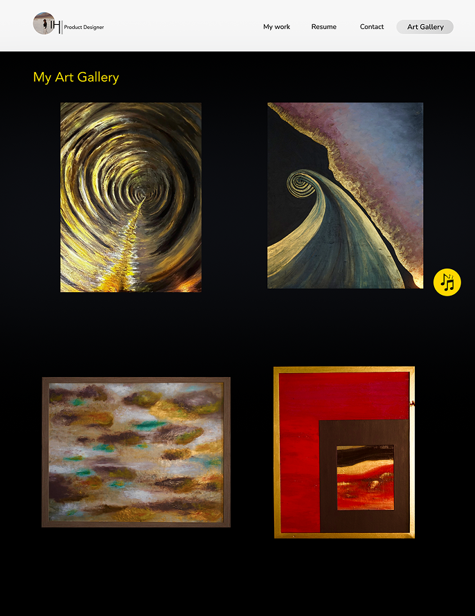
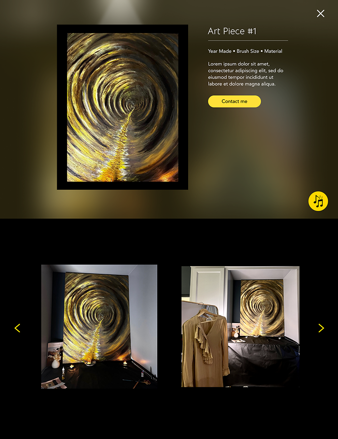
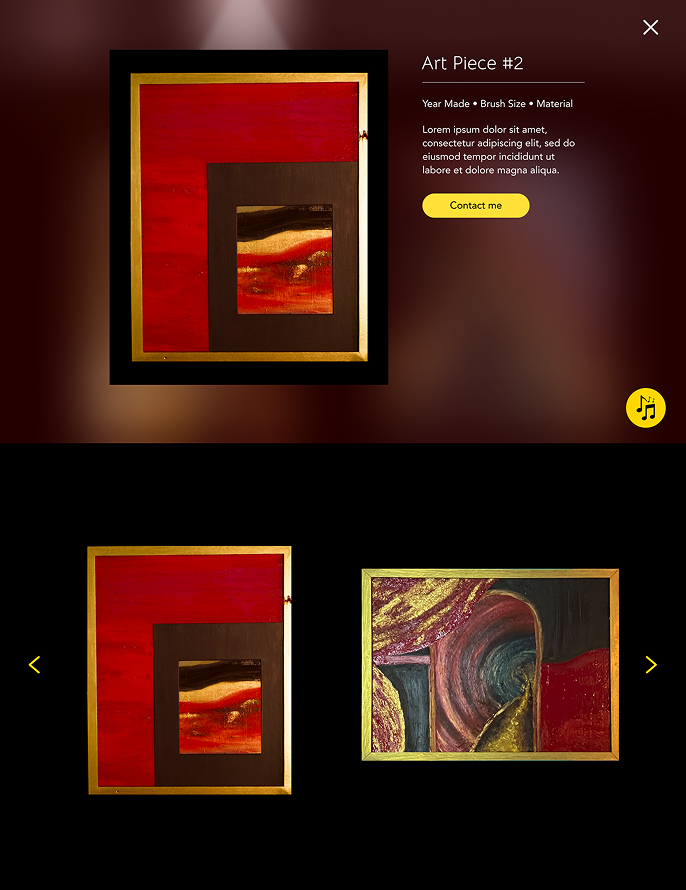
Created an interactive virtual gallery for visual artist Ines Hamadi, inspired by modern museums like MoMA and the de Young. The design transforms her portfolio into an immersive experience, complete with a custom navigation system, an interactive art gallery, and even a built-in music player to set the tone.
The result is a curated digital gallery that elevates Ines’s professional identity and creates a memorable experience for visitors.

Marin FC is a youth soccer club located in the California Bay Area. They are a relatively small club that focuses on recruiting talented players and creating competitive teams. Marin FC wishes to be established as a top club in the country and produce players that will play for colleges and professional teams.
I designed this crest with the two colors that Marin FC previously established as its brand. I drew inspiration from the images below.


Below are two full case studies that I created working with a team of designers. They include the research process and design decisions/reasoning. Each concludes with a clickable prototype built in Figma and an evaluation of the project outcomes.


